
Numpy and Matplotlib#
Numpy#
NumPy stands as a foundational Python package crucial for scientific computing. This library operates on ndarray objects, enabling swift and efficient calculations on arrays and matrices. Despite being utilized within Python, its rapid computing capabilities are attributed to components written in C or C++. Proficiency in this package is essential for a majority of computational tasks involving geoscience data. This workbook aims to illustrate fundamental applications of NumPy within this domain.
Matplotlib#
To depict the computations performed by NumPy or other packages, we employ Matplotlib. This toolkit enables the generation of static, animated, and interactive visualizations within the Python environment. Matplotlib simplifies the process of plotting intricate data and interactions, providing a visual means to articulate your data.
Learning Goals
Creating new arrays using
linspaceandarangeComputing basic formulas with numpy arrays
Loading data from
.npyfilesPerforming reductions (e.g.
mean,stdon numpy arrays)Making 1D line plots
Making scatterplots
Annotating plots with titles and axes
Creating and Manipulating Arrays#
Disclaimer: Kindly be aware that the questions and datasets featured in this tutorial were originally presented by Ryan Abernathy in “An Introduction to Earth and Environmental Data Science”.
The first step taken will always be the importation of the packages needed for your project. This will almost certainly include NumPy and Matplotlib. Let's import these two libraries
import numpy as np
import matplotlib.pyplot as plt
Creating two 2D arrays representing coordinates x, y on the cartesian plan#
There are two basic ways to create arrays of fixed length and range within NumPy. The methods used will be the
np.linspacefor returning evenly spaced numbers over a specified interval. By default the last value is used unless otherwise specified. interval is inclusive [x,y]np.linspace(start_value, stop_value, number_of_values)
- `np.arange` similar to the `range` method, it creates an array of numbers that are evenly spaced. This method does not include the stop value by default. This gives an interval of [x,y)
np.arange(start_value, stop_value, step)
np.linspace#
x = np.linspace(-2,2,100)
print(f"The x array length is {len(x)} and values \n {x}")
The x array length is 100 and values
 [-2.         -1.95959596 -1.91919192 -1.87878788 -1.83838384 -1.7979798
 -1.75757576 -1.71717172 -1.67676768 -1.63636364 -1.5959596  -1.55555556
 -1.51515152 -1.47474747 -1.43434343 -1.39393939 -1.35353535 -1.31313131
 -1.27272727 -1.23232323 -1.19191919 -1.15151515 -1.11111111 -1.07070707
 -1.03030303 -0.98989899 -0.94949495 -0.90909091 -0.86868687 -0.82828283
 -0.78787879 -0.74747475 -0.70707071 -0.66666667 -0.62626263 -0.58585859
 -0.54545455 -0.50505051 -0.46464646 -0.42424242 -0.38383838 -0.34343434
 -0.3030303  -0.26262626 -0.22222222 -0.18181818 -0.14141414 -0.1010101
 -0.06060606 -0.02020202  0.02020202  0.06060606  0.1010101   0.14141414
  0.18181818  0.22222222  0.26262626  0.3030303   0.34343434  0.38383838
  0.42424242  0.46464646  0.50505051  0.54545455  0.58585859  0.62626263
  0.66666667  0.70707071  0.74747475  0.78787879  0.82828283  0.86868687
  0.90909091  0.94949495  0.98989899  1.03030303  1.07070707  1.11111111
  1.15151515  1.19191919  1.23232323  1.27272727  1.31313131  1.35353535
  1.39393939  1.43434343  1.47474747  1.51515152  1.55555556  1.5959596
  1.63636364  1.67676768  1.71717172  1.75757576  1.7979798   1.83838384
  1.87878788  1.91919192  1.95959596  2.        ]
Code Explanation#
As mentioned, you can see we have an array of length \(100\) with an interval of \([-2,2]\). Feel free to take a look at the linspace documentation for more details
np.arange#
y = np.arange(-4,4,0.08)
print(f"The y array length is {len(y)} and values \n {y}")
The y array length is 100 and values
 [-4.00000000e+00 -3.92000000e+00 -3.84000000e+00 -3.76000000e+00
 -3.68000000e+00 -3.60000000e+00 -3.52000000e+00 -3.44000000e+00
 -3.36000000e+00 -3.28000000e+00 -3.20000000e+00 -3.12000000e+00
 -3.04000000e+00 -2.96000000e+00 -2.88000000e+00 -2.80000000e+00
 -2.72000000e+00 -2.64000000e+00 -2.56000000e+00 -2.48000000e+00
 -2.40000000e+00 -2.32000000e+00 -2.24000000e+00 -2.16000000e+00
 -2.08000000e+00 -2.00000000e+00 -1.92000000e+00 -1.84000000e+00
 -1.76000000e+00 -1.68000000e+00 -1.60000000e+00 -1.52000000e+00
 -1.44000000e+00 -1.36000000e+00 -1.28000000e+00 -1.20000000e+00
 -1.12000000e+00 -1.04000000e+00 -9.60000000e-01 -8.80000000e-01
 -8.00000000e-01 -7.20000000e-01 -6.40000000e-01 -5.60000000e-01
 -4.80000000e-01 -4.00000000e-01 -3.20000000e-01 -2.40000000e-01
 -1.60000000e-01 -8.00000000e-02  3.55271368e-15  8.00000000e-02
  1.60000000e-01  2.40000000e-01  3.20000000e-01  4.00000000e-01
  4.80000000e-01  5.60000000e-01  6.40000000e-01  7.20000000e-01
  8.00000000e-01  8.80000000e-01  9.60000000e-01  1.04000000e+00
  1.12000000e+00  1.20000000e+00  1.28000000e+00  1.36000000e+00
  1.44000000e+00  1.52000000e+00  1.60000000e+00  1.68000000e+00
  1.76000000e+00  1.84000000e+00  1.92000000e+00  2.00000000e+00
  2.08000000e+00  2.16000000e+00  2.24000000e+00  2.32000000e+00
  2.40000000e+00  2.48000000e+00  2.56000000e+00  2.64000000e+00
  2.72000000e+00  2.80000000e+00  2.88000000e+00  2.96000000e+00
  3.04000000e+00  3.12000000e+00  3.20000000e+00  3.28000000e+00
  3.36000000e+00  3.44000000e+00  3.52000000e+00  3.60000000e+00
  3.68000000e+00  3.76000000e+00  3.84000000e+00  3.92000000e+00]
Code Explanation#
This method has created an array of length \(100\) with an interval of \([-4,4)\). For more information, pleast take a look at the arange documentation
Visualising each 2D array using pcolormesh#
meshgrid()#
This function is used to create a rectangular grid out of two \(1D\) arrays. This function operates by making one array a \(n \times 1\) array and the other \(1 \times n\) and returning a a matrix corresponding to their interaction.

#making the grids
xx, yy = np.meshgrid(x, y)
print(f"The xx array a {xx.shape[0]} by {xx.shape[1]} matrix.")

xx
The xx array a 100 by 100 matrix.
array([[-2.        , -1.95959596, -1.91919192, ...,  1.91919192,
         1.95959596,  2.        ],
       [-2.        , -1.95959596, -1.91919192, ...,  1.91919192,
         1.95959596,  2.        ],
       [-2.        , -1.95959596, -1.91919192, ...,  1.91919192,
         1.95959596,  2.        ],
       ...,
       [-2.        , -1.95959596, -1.91919192, ...,  1.91919192,
         1.95959596,  2.        ],
       [-2.        , -1.95959596, -1.91919192, ...,  1.91919192,
         1.95959596,  2.        ],
       [-2.        , -1.95959596, -1.91919192, ...,  1.91919192,
         1.95959596,  2.        ]])
print(f"The yy array a {yy.shape[0]} by {yy.shape[1]} matrix.")

yy
The yy array a 100 by 100 matrix.
array([[-4.  , -4.  , -4.  , ..., -4.  , -4.  , -4.  ],
       [-3.92, -3.92, -3.92, ..., -3.92, -3.92, -3.92],
       [-3.84, -3.84, -3.84, ..., -3.84, -3.84, -3.84],
       ...,
       [ 3.76,  3.76,  3.76, ...,  3.76,  3.76,  3.76],
       [ 3.84,  3.84,  3.84, ...,  3.84,  3.84,  3.84],
       [ 3.92,  3.92,  3.92, ...,  3.92,  3.92,  3.92]])
Code Explanation#
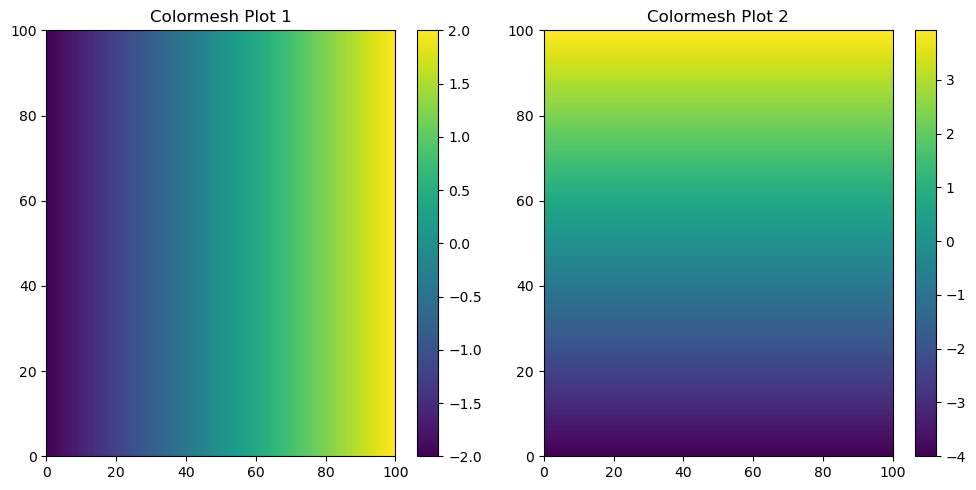
The function produces two arrays, both with dimensions of \(100 \times 100\). The xx array represents the pairwise interaction of the x values with themselves. This implies that we utilize the x values as both a \(100 \times 1\) array and a \(1 \times 100\) array, resulting in the creation of the \(100 \times 100\) grid.
Let’s attempt to visualise these grids using the pcolormesh function from matplotlib.
pcolormesh#
#create figure and subplot
f, (ax1, ax2) = plt.subplots(1, 2, figsize=(10, 5))

# Plot the colormesh on the first subplot
c1 = ax1.pcolormesh(xx)
ax1.set_title('Colormesh Plot 1')
plt.colorbar(c1, ax=ax1)  # Add a colorbar to the first subplot

# Plot the colormesh on the second subplot
c2 = ax2.pcolormesh(yy)  # yy for the second plot
ax2.set_title('Colormesh Plot 2')
plt.colorbar(c2, ax=ax2)  # Add a colorbar to the second subplot

plt.tight_layout()  # Automatically adjust subplot parameters for a better layout
plt.show()
Code Explanation#
The above code may seem confusing but let’s go through it line by line
plt.subplot()is a function from the matplotlib package, specifically from its pyplot modules. Three arguments were passed to this function.The first argument corresponds to the number of rows of the subplot, in this case there will be \(1\) row.
The second argument corresponds to the number of columns of the subplot, in this case there will be \(2\) columns.
The third argument is for setting the side of the figure in which these plots will be placed, the size is \(10\) wide and \(5\) tall.
The function then returns a variable for the manipulation of the complete figure
fand two variables for the manipulation of individual subplotsax1andax2pcolormeshis the actual type of plot you will be creating within a specifc subplot.The function takes a \(2D\) array and makings a continous colour scale showing how the values within the grid change in a vertical and horizontal direction. I assign this object to a variable,
c1.set_titleis the function for the creation of a title for a specific subplot.colorbaris the function which creates a colorbar to act as the legend for an individual subplot. This function takes the plot object and subpolot location as arguments.
Displaying the final product
The
plt.tight_layout()function to automatically adjust the spacing between your subplots. Sometimes individual suboplot figures may overlap, this function helps to prevent this.The
plt.show()function displays your figure on your screen.
Creating polar coordinates \(r\) and \(\varphi\)#
Refer to the wikipedia page for the conversion formula. This will make use of numpy’s arctan2 function. Read its documentation.
def convert_to_polar(x,y):
    """
    function for converting cartesian plane coordinates to polar coordindates
    the function takes 2 numpy arrays of equal length
    returns the r coordinates and the phi coordinates
    """
    r = np.sqrt(x**2 + y**2)
    print(len(r))
    phi = np.arctan2(y,x)
    print(len(phi))
    return r, phi


r, phi = convert_to_polar(x,y)
100
100
Although beyond the current scope of this tutorial, we can enhance code modularity by creating functions, thereby maintaining a cleaner and more organized notebook. The function above for converting Cartesian to polar coordinates serves as an example.
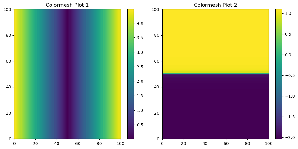
Visualising \(r\) and \(\varphi\) on the 2D \(x\) / \(y\) plane using pcolormesh#
Repeating the previously outlined steps, this time we will utilize polar coordinates. It’s crucial to bear in mind this conversion when dealing with geoscience data, as such datasets may necessitate transformations to and from polar coordinates for comprehensive analysis.
rr, phiphi = np.meshgrid(r, phi)

f, (ax1, ax2) = plt.subplots(1, 2, figsize=(10, 5))

# Plot the colormesh on the first subplot
c1 = ax1.pcolormesh(rr)
ax1.set_title('Colormesh Plot 1')
plt.colorbar(c1, ax=ax1)  # Add a colorbar to the first subplot

# Plot the colormesh on the second subplot
c2 = ax2.pcolormesh(phiphi)  # phiphi for the second plot
ax2.set_title('Colormesh Plot 2')
plt.colorbar(c2, ax=ax2)  # Add a colorbar to the second subplot

plt.tight_layout()  # Automatically adjust subplot parameters for a better layout
plt.show()
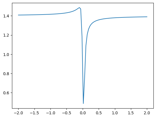
Calculating the quanity \(f = \cos^2(4r) + \sin^2(4\varphi)\)#
pcolormesh to visualise function outputs
f = (np.cos(4*rr) * np.cos(4*rr)) + (np.sin(4*phiphi)*np.sin(4*phiphi))
plt.pcolormesh(f)
<matplotlib.collections.QuadMesh at 0x7f185ea91d10>
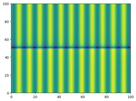
Notice the output plot shows how the function \(f = \cos^2(4r) + \sin^2(4\varphi)\) varies over values of \(\varphi\) and \(r\)
Plotting the mean of f with respect to the x-axis and plot as a function y#
We can also make simple plots using matplotlib and its plot() function. Below, we will examine how the mean value of \(f\) varies with respect to \(x-axis\) as a function \(y\)
To clarify, the task involves calculating the mean of the f values horizontally across the matrix, essentially compressing each column to a single mean value. Subsequently, the objective is to create a plot where these mean values are presented in relation to the corresponding values of y.
#Plot the mean of f with respect to the x axis  as a function of y

plt.plot(y,f.mean(axis=0)) #axis=0 for x axis
plt.show()
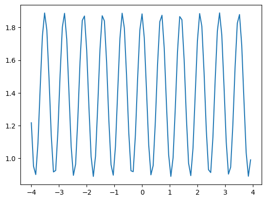
Code Explanation#
plt.plot()is used for creating line plots. It takes two values - an independent variableyin this case and a dependent variablef.mean()the
np.mean(axis=0)is for the calculation of the mean as a column-wise operation, i.e each column’s mean is taken.axis=1can also be used to calculate the mean of each rowaxis=0is the first axis of an array andaxis=1is the second axis
As you can see, Numpy functions can be called directly within Matplotlib functions
Plotting the mean of f with respect to the y axis and plot as a function of x#
We can also make simple plots using matplotlib and its plot() function. Below, we will examine how the mean value of \(f\) varies with respect to \(y-axis\) as a function \(y\)
#Plot the mean of f with respect to the y axis  as a function of x

plt.plot(x,f.mean(axis=1)) #axis=1 for y axis
[<matplotlib.lines.Line2D at 0x7f185eb6fdd0>]
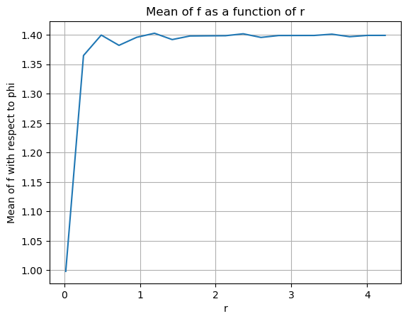
Plotting the mean of \(f\) with respect to \(\phi\) as a function of \(r\)#
Let’s try something more difficult.
You will need to define a discrete range of \(r\) values and then figure out how to average \(f\) within the bins defined by your \(r\) grid. There are many different ways to accomplish this.
# Define the range of r values and the number of bins
r_min = r.min()
r_max = r.max()
num_bins = 20  # Adjust the number of bins as needed

# Create an array of evenly spaced r values
r_values = np.linspace(r_min, r_max, num_bins)

# Initialize list to store the mean values of f for each bin
mean_values = []

# Loop through the r values and calculate the mean of f in each bin
for i in range(len(r_values) - 1):
    r_min_bin = r_values[i]
    r_max_bin = r_values[i + 1]

    # Calculate the mean of f for the current bin

    mean_f_bin = np.mean(f[np.where((r >= r_min_bin) & (r < r_max_bin))])

    mean_values.append(mean_f_bin)

# Create a plot of the mean of f as a function of r
plt.plot(r_values[:-1], mean_values)
plt.xlabel('r')
plt.ylabel('Mean of f with respect to phi')
plt.title('Mean of f as a function of r')
plt.grid(which='major')
plt.show()
Code Explanation#
Define the range of r values and the number of bins
Variables to store the minimum and maximum valures of r using the
np.min()andnp.max()functions are created.A variable to set the number of bins you will divide the \(\varphi\) into.
Create an array of evenly spaced r values
Using
np.linspace, a range of values is specified, each being evenly spaced. Pairs of these act as the start and end points of each individual bin.
Initialize list to store the mean values of f for each bin
An empty list for storing the mean values of each bin
Loop through the r values and calculate the mean of f in each bin
for i in range(len(r_values) - 1)we create a range of starting at 0 and ending at the length ofr_values\(- 1\)Set the lower and upper bounds of an individual bin
By employing
np.where(), we can define a range where values are returned if the specified condition holds true.A mean of these returned values is taken.
This returned mean is then appended to the
mean_valueslist.
Create a plot of the mean of f as a function of r
Make the line plot object using the np.array of
r_valuesfrom the first index to the last & the list ofmean_values.plt.xlabel()is the function for giving the \(x-axis\) a title.plt.ylabel()does the same for the \(y-axis\).plt.title()is utilized to set the title for the entire figure, encompassing all subplots. It’s important to note thatplt.set_title()is employed for assigning titles to individual subplots within the figure.plt.grid()allows for the greation of gridlines on a specific plot.
At this point, you should have gained a more comprehensive understanding of how to leverage the capabilities of the NumPy and Matplotlib libraries. Let’s apply these skills to a real-world dataset
Part 2: Analyze ARGO Data#
In this problem, we use real data from ocean profiling floats. ARGO floats are autonomous robotic instruments that collect Temperature, Salinity, and Pressure data from the ocean. ARGO floats collect one “profile” (a set of messurements at different depths or “levels”).
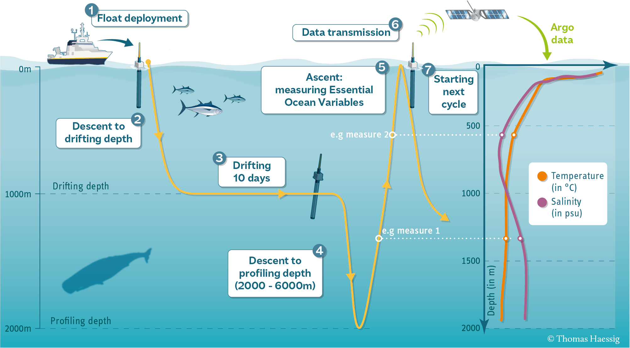
Each profile has a single latitude, longitude, and date associated with it, in addition to many different levels.
Let’s start by using pooch to download the data files we need for this exercise.
The following code will give you a list of .npy files that you can open in the next step.
import pooch
url = "https://www.ldeo.columbia.edu/~rpa/float_data_4901412.zip"
files = pooch.retrieve(url, processor=pooch.Unzip(), known_hash="2a703c720302c682f1662181d329c9f22f9f10e1539dc2d6082160a469165009")
files
Downloading data from 'https://www.ldeo.columbia.edu/~rpa/float_data_4901412.zip' to file '/home/jovyan/.cache/pooch/7e6685dbe2a3c0b0870f770f3ef413d9-float_data_4901412.zip'.
Unzipping contents of '/home/jovyan/.cache/pooch/7e6685dbe2a3c0b0870f770f3ef413d9-float_data_4901412.zip' to '/home/jovyan/.cache/pooch/7e6685dbe2a3c0b0870f770f3ef413d9-float_data_4901412.zip.unzip'
['/home/jovyan/.cache/pooch/7e6685dbe2a3c0b0870f770f3ef413d9-float_data_4901412.zip.unzip/float_data/levels.npy',
 '/home/jovyan/.cache/pooch/7e6685dbe2a3c0b0870f770f3ef413d9-float_data_4901412.zip.unzip/float_data/T.npy',
 '/home/jovyan/.cache/pooch/7e6685dbe2a3c0b0870f770f3ef413d9-float_data_4901412.zip.unzip/float_data/S.npy',
 '/home/jovyan/.cache/pooch/7e6685dbe2a3c0b0870f770f3ef413d9-float_data_4901412.zip.unzip/float_data/date.npy',
 '/home/jovyan/.cache/pooch/7e6685dbe2a3c0b0870f770f3ef413d9-float_data_4901412.zip.unzip/float_data/P.npy',
 '/home/jovyan/.cache/pooch/7e6685dbe2a3c0b0870f770f3ef413d9-float_data_4901412.zip.unzip/float_data/lon.npy',
 '/home/jovyan/.cache/pooch/7e6685dbe2a3c0b0870f770f3ef413d9-float_data_4901412.zip.unzip/float_data/lat.npy']
Code Explanation#
In this section, we make use of the pooch library to effortlessly download data files and neatly organize them in a designated directory. The URL is defined, and with a simple command, the download is initiated. Specifically, we employ the pooch.Unzip() function to unzip each file. It’s worth noting that we enhance data security by specifying the known_hash parameter, ensuring the integrity of the downloaded data. If your hash is not known, it is crucial to set this field to None.
The function returns a list of directory addresses of each file.
Loading data files as numpy arrays.#
You can use whatever names you want for your arrays, but I recommend
T: temperature
S: salinity
P: pressure
date: date
lat: latitude
lon: longitude
level: depth level
Note: you have to actually look at the file name (the items in files) to know which files corresponds to which variable.
#assign each .npy file to a variable
levels = np.load(files[0])
Temperature = np.load(files[1])
Salinity = np.load(files[2])
date = np.load(files[3])
Pressure = np.load(files[4])
lon = np.load(files[5])
lat = np.load(files[6])
Code Explanation#
As shown above, the files object comprises a list of directory addresses. By employing list indexing, each file can be asisgned to a specific variable. For instance, the first file location contains data for the levels so we can access it using files[0]. Then we can load the data using the np.load() function.
Examining the shapes of T, S and P compared to lon, lat, date and level#
Based on the shapes, which dimensions do you think are shared among the arrays?
argo_vars = [levels, Temperature, Salinity, date, Pressure, lon, lat]

for var in argo_vars:
    print(var.shape)
(78,)
(78, 75)
(78, 75)
(75,)
(78, 75)
(75,)
(75,)
Data Structure Explanation#
The data structures are as follows:
levelsis a 78 x 1 array.lon,latare 75 x 1 arrays.T,S, andPare 75 x 78 arrays.
This arrangement signifies that each cell in the Temperature, Salinity, and Pressure arrays contains 75 values. These values correspond to measurements taken at specific latitude (lat), longitude (lon). Importantly, this pattern is repeated for each of the 78 levels, forming a multi-dimensional dataset where each level contains a profile with specific latitude and longitude, and each cell represents a measurement at a unique combination of these parameters.
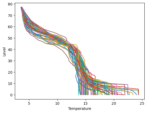
Making a plot for each column of data in Temperature, Salinity and Pressure (three plots).#
The vertical scale is the levels data. Each plot should have a line for each column of data. Yes, it looks messy.
plt.plot(Temperature,levels)
plt.xlabel("Temperature")
plt.ylabel("Level")
plt.show()
plt.plot(Salinity,levels)
plt.xlabel("Temperature")
plt.ylabel("Salinity")
plt.show()
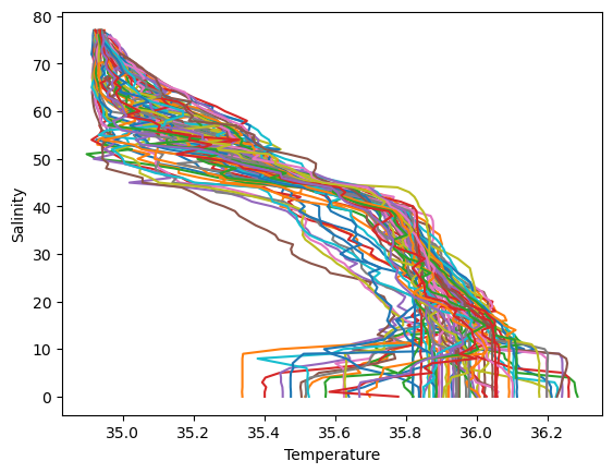
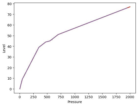
plt.plot(Pressure,levels)
plt.xlabel("Pressure")
plt.ylabel("Level")
plt.show()
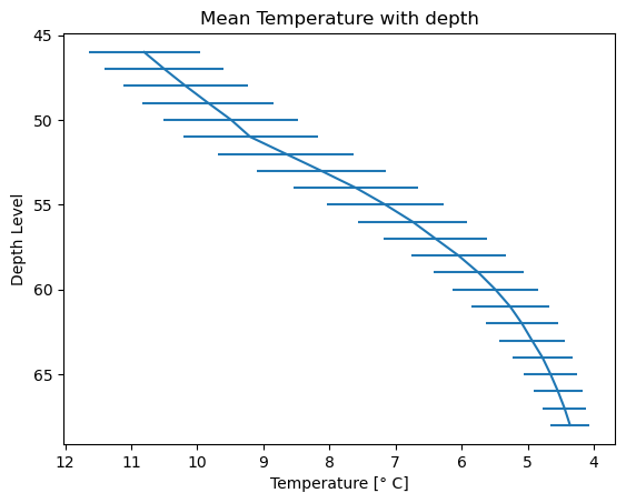
Computing the mean and standard deviation of each of T, S and P at each depth in level.#
Salinity_mean = Salinity.mean(axis=1)
Temperature_mean = Temperature.mean(axis=1)
Pressure_mean = Pressure.mean(axis=1)

Salinity_std = Salinity.std(axis=1)
Temperature_std = Temperature.std(axis=1)
Pressure_std = Pressure.std(axis=1)
Code Explanation#
Remember that the measured variables have dimensions \(78 \times 75\) indicating that each row corresponded to the levels variable with dimensions of \(78 \times 1\). Consequently, to obtain the mean or standard deviation value at each level, a row-wise operation must be taken along the axis=1
The result is a ndarray of means/standard devidations with dimensions of \(78 \times 1\), where each value represents the mean/standard deviation at a specific level.
Making three similar plot, but showing only the mean T, S and P at each depth.#
Error bars on each plot using the standard deviations.
Matplotlib again comes in useful with its errorbar() function.
Salinity
# Create a plot
plt.errorbar(x=Salinity_mean, y=levels, xerr=Salinity_std)

# Invert the y-axis (gives a more interpretable plot)
plt.gca().invert_yaxis()

# Set title and labels
plt.title('Mean Salinity with depth')
plt.xlabel('Salinity')
plt.ylabel('Depth Level')

# Display the plot
plt.show()
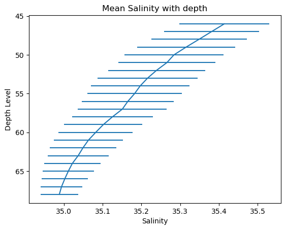
Code Explanation#
errorbar()function needs 3 fundamention argumentsx- the independent variable or the variable for your \(x-axis\). Here the variable isSalinity_meany- the dependent variable or the variable for your \(y-axis\). Here the variable islevels
plt.gca().invert_yaxis()is used for inverting your axis since level increases as you descend.gca()stands for get current axes for the current figure or plotinvert_yaxis()inverts the \(y-axis\) causing it to decrease with height. There is also a counterpart function for the \(x-axis\) shown in the next plot.
Temperature
# Create a plot
plt.errorbar(x=Temperature_mean, y=levels, xerr=Temperature_std)

# Invert the y-axis
plt.gca().invert_yaxis()
plt.gca().invert_xaxis()

# Set title and labels
plt.title('Mean Temperature with depth')
plt.xlabel('Temperature [\u00b0 C]')
plt.ylabel('Depth Level')

# Display the plot
plt.show()
Pressure
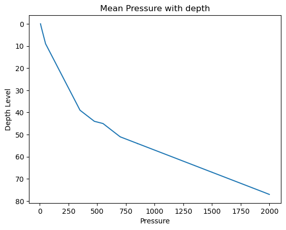
# Create a plot
plt.errorbar(x=Pressure_mean, y=levels, xerr=Pressure_std)

# Invert the y-axis
plt.gca().invert_yaxis()

# Set title and labels
plt.title('Mean Pressure with depth')
plt.xlabel('Pressure')
plt.ylabel('Depth Level')

# Display the plot
plt.show()
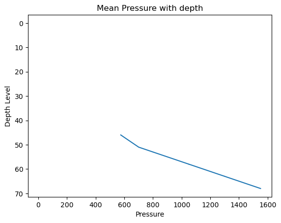
It is important to note is that the Pressure, Salinity, and Temperature variables contain some missing values, and the np.mean()/np.std() functions, by default, do not handle these missing values. This becomes evident in the Pressure_mean plot, where values below \(600\) are not plotted due to this limitation.
Missing Data#
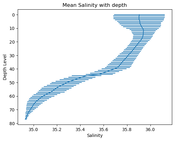
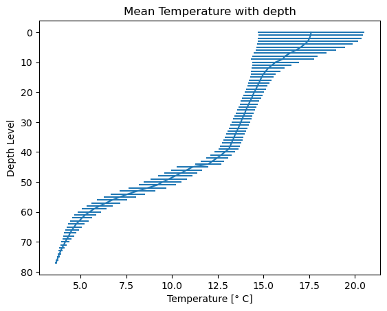
The profiles contain many missing values. These are indicated by the special “Not a Number” value, or np.nan.
When you take the mean or standard deviation of data with NaNs in it, the entire result becomes NaN. Instead, if you use the special functions np.nanmean and np.nanstd, you tell NumPy to ignore the NaNs.
Compare plots which use the np.mean() and np.std() functions to those using np.nanmean() and np.nanstd() functions
Salinity_mean = np.nanmean(Salinity,axis=1)
Temperature_mean = np.nanmean(Temperature,axis=1)
Pressure_mean = np.nanmean(Pressure,axis=1)

Salinity_std = np.nanstd(Salinity,axis=1)
Temperature_std = np.nanstd(Temperature,axis=1)
Pressure_std = np.nanstd(Pressure,axis=1)
# Create a plot
plt.errorbar(x=Salinity_mean, y=levels, xerr=Salinity_std)

# Invert the y-axis
plt.gca().invert_yaxis()

# Set title and labels
plt.title('Mean Salinity with depth')
plt.xlabel('Salinity')
plt.ylabel('Depth Level')

# Display the plot
plt.show()
# Create a plot
plt.errorbar(x=Temperature_mean, y=levels, xerr=Temperature_std)

# Invert the y-axis
plt.gca().invert_yaxis()

# Set title and labels
plt.title('Mean Temperature with depth')
plt.xlabel('Temperature [\u00b0 C]')
plt.ylabel('Depth Level')

# Display the plot
plt.show()
# Create a plot
plt.errorbar(x=Pressure_mean, y=levels, xerr=Pressure_std)

# Invert the y-axis
plt.gca().invert_yaxis()

# Set title and labels
plt.title('Mean Pressure with depth')
plt.xlabel('Pressure')
plt.ylabel('Depth Level')

# Display the plot
plt.show()
Scatterplot of the lon, lat positions of the ARGO float.#
Using the plt.scatter function.
# Create a scatter plot of lon and lat positions
plt.scatter(x=lon, y=lat, c='r', s=10, marker='x', label='ARGO Float Positions')

# Add labels and title
plt.xlabel('Longitude')
plt.ylabel('Latitude')
plt.title('ARGO Float Positions Over Time')

# Display a legend
plt.legend()

#set gridlines
plt.grid(which='major')

# Show the plot
plt.show()
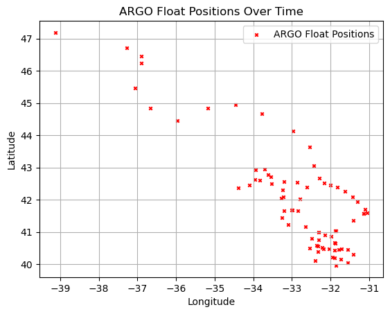
Code Explanation#
plt.scatter()is used for the creation of scatterplotsx- the \(x-axis\) variable, in this case we use longitude as it naturally varies horizontally (West-East)y- the \(y-axis\) variable, latitude which varies vertically (North-South)c- is the color for each point on plot. Learn more about colors here.s- the size of each point. The can either a float or int valuemarker- the shape of each point.Matplotlibprovides many different marker shapes. I invite you to check them out here.label- this argument takes a str and allows you to create a legend for your points
plt.legend()returns the legend of your plot. You will see other usages of this function in later tutorials.
Final Thoughts#
Congratulations on completing this introduction to NumPy and Matplotlib! By now, you should have a heightened appreciation for these packages and a grasp of basic data manipulation using NumPy, along with the ability to create visually appealing and interpretable graphs and plots using Matplotlib.
Remember, practice is key to solidifying your understanding. Take the time to experiment with creating different plots and conducting various calculations on your own before moving forward. Happy learning!